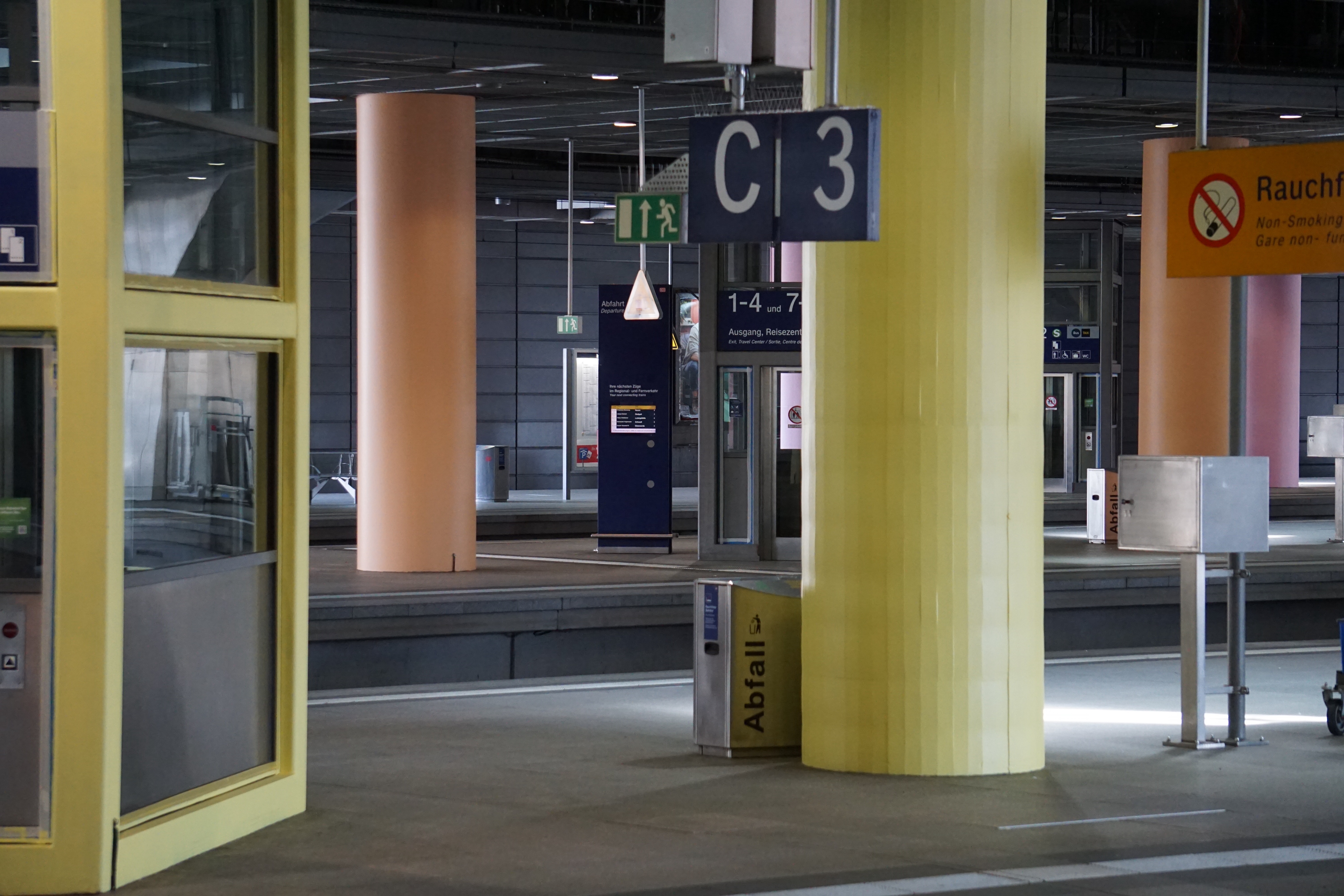
The concept’s centerpiece is a bold color-coded system in vibrant pastel tones, mapping each station level and track direction to simplify navigation and highlight the quickest routes. This overhaul not only made Berlin Südkreuz more intuitive but also established a striking new identity, acting as a Meta-Layer above all other communication.
With identical entrance halls, a main hall, and multiple platforms, travelers often struggled to find their way. Our solution? A distinct color-coded identity: Plaza Schönefeld in turquoise and Plaza Tempelhof in purple, giving each entrance hall a unique character. The addition of "sparks" on walls and glass surfaces symbolized the “initial spark” of a journey, transforming the spaces with vibrant light effects throughout the day.
A custom icon system and sparks guiding travelers to shops further enhanced the design, creating a seamless pathway through the station. The color concept spans all levels, providing clarity and energy—a breath of fresh air compared to the station's former gray tones.